 Animated Elements
Animated elements for GoHighLevel.
36 animated elements that drop straight into the page builder. Counters, headlines, buttons and section backgrounds, each with 2369+ controls across the library and no code to write.
- No code required
- No CDN or external dependencies
- Separate desktop and mobile control
- Works on any funnel or website page
36 elements, 2369 controls.
Every one runs on plain scoped HTML, CSS and JavaScript with nothing loaded from anywhere else.
- Stats & Social Proof
Animated Counter
Numbers that count up when they scroll into view. Prefix, suffix, decimals, gradient fill, easing, and full mobile control.
41 controls - Text & Headlines
Typing Animation
Headlines that type themselves out. Rotate through a list of phrases, once on load or looping forever, with real cursor styles and per-letter effects.
51 controls - Text & Headlines
HyperText Scramble
Text that decodes itself out of random characters. Fires on load, on scroll, on hover or on click. Once, or repeating forever.
44 controls - Text & Headlines
Word Rotate
Headline words that trade places with polished slide, blur, flip, scale, or fade motion, built to stay sharp on mobile and stable between phrases.
53 controls - Text & Headlines
Highlighter
Mark words the way a person would: marker sweep, underline, box, circle, strike, cross or brackets, sketched on as the visitor arrives. Multiple phrases per line, every line of a wrap.
43 controls - Buttons & CTAs
Magnetic Button
A call to action that leans toward the cursor and springs back, with the label drifting a little further than the button. Ten click actions including GoHighLevel's popup and next-step events.
63 controls - Buttons & CTAs
Spotlight Button
A light tracks the cursor across the button and the label inverts as it passes underneath, so the text stays readable over both. Same ten click actions as the Magnetic Button.
64 controls - Text & Headlines
Depth Text
Real layered 3D type that tilts toward the visitor and drifts while idle. Tune the extrusion, camera, lighting, face, depth color and mobile motion independently.
60 controls - Section Backgrounds
Flickering Grid
A grid of squares that flicker behind your section. Drop it anywhere inside the section and it paints the section itself. The widget stays invisible on the live page. Targets a section, row, column or any class you name.
21 controls - Buttons & CTAs
Moving Border Button
A luminous two-color glow travels around a conversion-ready button edge. Includes ten click actions, deep visual controls and responsive sizing.
67 controls - Buttons & CTAs
Specular Button
A light rides the button's edge, lighting two opposite arcs at once, and swings toward the cursor as it approaches. The resting look lives in CSS, so it is lit before any script runs. Ten click actions.
71 controls - Section Backgrounds
Animated Grid Pattern
Crisp SVG grid lines with seeded cells that softly pulse, relocate and repeat across a section, row, column or custom target. Includes independent mobile density, masks, blending and performance controls.
42 controls - Section Backgrounds
Background Beams
Beams of light travelling along a fan of curved rails across your section. Drop it anywhere inside the section and it paints the section itself. The widget stays invisible on the live page. Targets a section, row, column or any class you name.
28 controls - Stats & Social Proof
Animated Tooltip
A row of overlapping faces. Hovering one lifts it out of the stack and floats a card above it with the person's name and role, tilting toward the cursor. Leave the photo out and you get their initials instead.
44 controls - Stats & Social Proof
Live Users Now
A pulsing live-presence count with individually flipping digits, deterministic bounded updates, responsive layout, and deep motion and styling controls.
69 controls - Cards & Content
Electric Border Card
A full-content conversion card with independently optional blocks, complete GHL button actions, and a living two-color electric edge.
151 controls - Cards & Content
Tilted Card
A full-depth image card that tilts toward the cursor, lifts layered overlay copy and follows with a floating label. Ships with a stock photograph in place, swap in a Media Storage link, and a polished cover stands in when there is no image.
91 controls - Cards & Content
3D Card Effect
A card that leans toward the cursor while its headline, text, image and buttons float at their own heights above the surface. Every part can be switched off, and both calls to action carry the full click-action list.
99 controls - Text & Headlines
Gradient Text
Multi-stop color flows through any headline, with horizontal, vertical, diagonal or custom travel, hover control and an optional matching gradient frame.
67 controls - Cards & Content
Animated Gradient Card
A premium content card with a rotating multi-color border, headline shine, cursor spotlight and a fully configurable GoHighLevel-ready action.
167 controls - Images
Pixel Image
A photograph that assembles itself out of pixel tiles, scattered, swept or spiralling out from the middle, arriving in black and white and washing into colour. Seven reveal orders, a repeatable shuffle, mosaic grout, and a designed placeholder before any image is added.
56 controls - Images
Circular Gallery
A strip of image cards bent over an arc that drags, drifts and loops forever. Grab it with a finger or the mouse, let it settle on the nearest card, or leave it drifting on its own, with a designed placeholder for every card before an image is added.
61 controls - Testimonials
Testimonial Marquee
Rows of review cards sliding past on a loop, the second row travelling the other way, edges fading out and everything holding still while a visitor hovers a quote. Generated avatars mean no photographs are needed to look finished.
51 controls - Images
Accordion Gallery
One image opens wide while the rest contract into a cinematic strip, with hover, tap, keyboard and autoplay controls plus resilient image placeholders.
89 controls - Testimonials
Animated Testimonials
A deck of portraits with one face-on and the rest tilted behind it, beside the quote it belongs to. Stepping forward hops the next photo to the top of the pile and the new quote arrives a word at a time, each one un-blurring in turn.
68 controls - Images
Depth Carousel
A cinematic stack of image cards receding through real 3D space, with drag, wheel, keyboard, autoplay and fully styled navigation.
120 controls - Text & Headlines
Canvas Text
A headline whose marked words are painted with wavy stripes running through the letters
40 controls - Section Backgrounds
Molten Metal
Liquid metallic caustics flowing behind a section, row or column with three-color lighting, grain and pointer-reactive distortion.
44 controls - Section Backgrounds
Gradient Waves
A raymarched horizon of rolling gradient waves behind your section. Three colours from the distance to the crest, haze depth, film grain and pointer parallax, with its own mobile field of view and detail.
46 controls - Stats & Social Proof
Logo Cloud
Client and partner logos sliding past on a loop, drained of colour until a visitor hovers one. Swap the placeholder marks for your own Media Storage links; any logo left without one falls back to showing its name as a wordmark, so a dead link never leaves a broken image mid-row.
39 controls - Buttons & CTAs
Liquid Metal Button
A poured-alloy call to action with a sheen that swings across the face on hover, a gloss that follows the cursor and eight metals to pick from.
70 controls - Buttons & CTAs
Underline Sweep Button
A quiet text link whose underline wipes in from one side and out of the other: solid, dashed or dotted, flat or gradient.
58 controls - Buttons & CTAs
Slide Swap Button
Two faces in one button: the first slides out of frame as a second slides in behind it, in any direction, each with its own copy and colours.
67 controls - Buttons & CTAs
Flip Text Button
The label rolls out of the frame with a lean while a second copy rolls in behind it: same words, or a second line of copy.
65 controls - Images
Image Comparison
Two photographs in one frame with a divider the visitor drags across them. Left-to-right or top-to-bottom, with labels, a sweep-in intro and keyboard control.
77 controls - FAQs
FAQs with Badges
An accordion of questions, each able to carry a badge like Popular or New. One answer open by default, full control of the cards, badges and type.
82 controls
The builder gives you static pages. Buyers respond to motion.
Most GoHighLevel pages look like the template they came from. The copy might be right and the offer might be right, but the page reads as generic, and generic costs you conversions on traffic you already paid for. Animated Elements gives you the motion layer the builder does not ship: counters that prove the number, headlines that hold attention, buttons that ask to be clicked, and backgrounds that make a hero feel built rather than assembled.
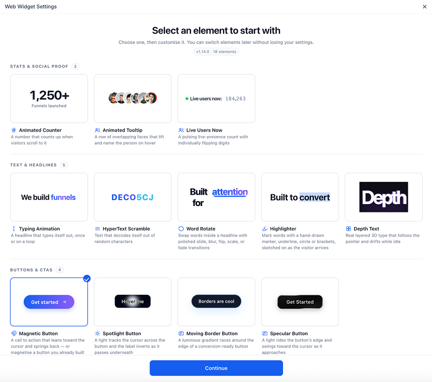
Pick the job you need done.
8 elements
Buttons & CTAs
How to use them, and every variant running live.
7 elements
Text & Headlines
How to use them, and every variant running live.
5 elements
Section Backgrounds
How to use them, and every variant running live.
5 elements
Images
How to use them, and every variant running live.
4 elements
Stats & Social Proof
How to use them, and every variant running live.
4 elements
Cards & Content
How to use them, and every variant running live.
2 elements
Testimonials
How to use them, and every variant running live.
1 element
FAQs
How to use them, and every variant running live.
Or start from a whole funnel.
Complete GoHighLevel funnels and websites, built for real offers and delivered as share links. Open one inside your sub-account and it imports in about a minute.
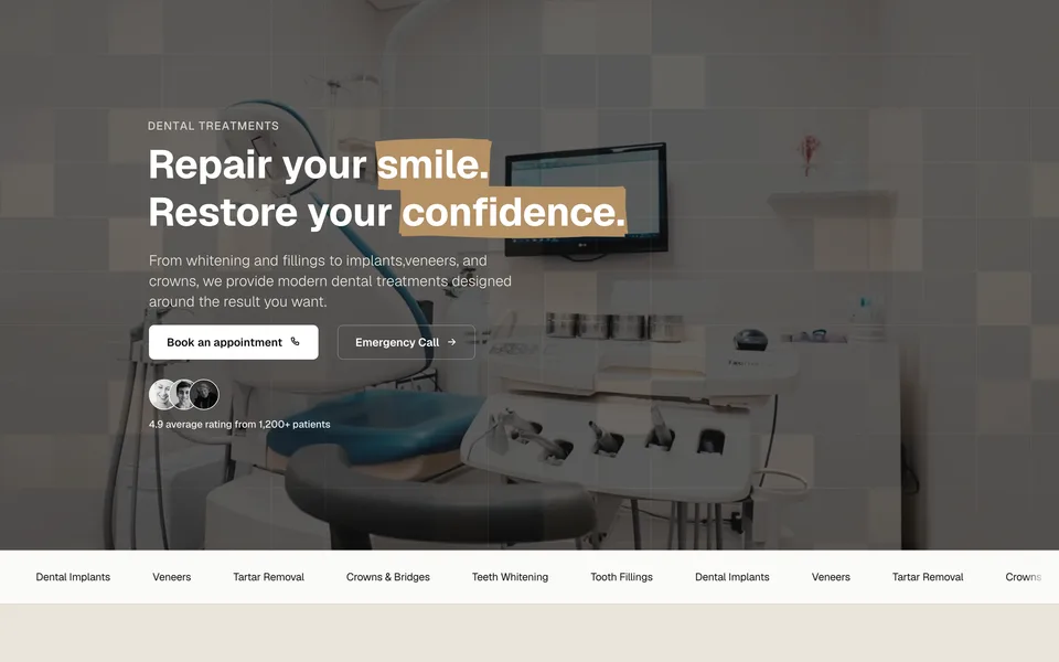
Dental clinic · Free
ReoDental
Appointment booking funnel for dental clinics, built around before and after proof.
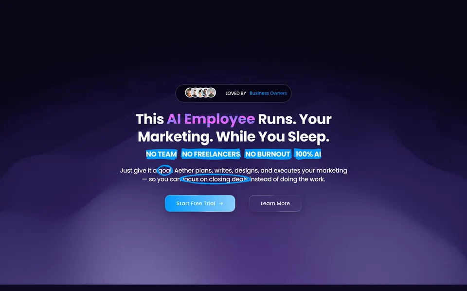
AI marketing tool · Free
Aether AI
Three-step free trial funnel for an AI marketing tool sold to agencies.
The whole library
Funnel templates, website templates, and the free ones as they ship. Live previews on every listing, so you see the page before you take it.
What people ask before installing.
- What is Animated Elements for GoHighLevel?
- It is a widget you install once from the GoHighLevel Marketplace. Inside it sits a library of animated elements: counters, typing headlines, scramble text, rotating words, hand-drawn highlighters, 3D type, magnetic and spotlight buttons, and animated section backgrounds. Drop the widget on a page, pick an element, and customize it in the builder.
- Do I need to write code?
- No. Every element is configured from the builder with normal controls: text, colours, timing, easing, spacing, and separate desktop and mobile sizing. Nothing requires a custom code block or an embed.
- Will it slow my funnel down?
- Each element emits plain scoped HTML, CSS and JavaScript with no external dependencies. There is no CDN call, no font download, and no framework to load, so an element adds no network requests to your page.
- Does it work on mobile?
- Yes, and mobile is configured separately rather than inherited. Sizes, spacing and motion have their own mobile controls, and the builder preview has a mobile view so you can check both before publishing.
- Where can I use these elements?
- Anywhere the GoHighLevel page builder runs: funnel steps, websites, landing pages, order forms and upsell pages. The section background element also targets a section, row, column, or any class you name.
- Can agencies install it across sub-accounts?
- Yes. The app supports agency bulk install, so you can roll it out across sub-accounts instead of installing it one client at a time.